
Real Estate Website Design: 2026 Guide to Convert More Visitors
Real estate website design that drives leads, not just visits. Layouts, listing pages, mobile UX and AI tools to turn traffic into qualified buyer enquiries.
If you run a real estate agency, you’ve probably been through this. You invest in a new website, pick a nice template, upload properties and, for a few weeks, you feel like you finally have a serious digital presence. Then reality hits. There are visits, but few contacts. Users view two or three listings and disappear. The sales team still relies on portals, phone calls and WhatsApp.
That’s the problem with many real estate websites. They act as a brochure, not as a lead-generation system. They show properties but don’t help the visitor take the next step. And in a market where most property searches now start on a phone, a site that doesn’t solve the mobile experience loses a huge portion of demand from the first click.
From “Digital Brochure” to Lead Machine
A profitable real estate website doesn’t start with visual design. It starts with a tougher question: What specific action do you want the visitor to take? If that answer isn’t clear, the project usually ends up as a site that looks right but doesn’t drive business.
I’ve seen the same pattern many times. A big hero photo, a generic headline, an overloaded menu, property pages that add little value and forms that seem tacked on as an afterthought. The result is predictable. The user browses, compares and leaves no trace.
What changes when you design for conversion
A portal built to capture leads behaves like an organized salesperson. It filters, presents, answers doubts, builds trust and asks for contact at the right moment.
That forces different decisions from the start:
- Define a primary objective. Capture sellers, buyers, landlords or tenants.
- Prioritize navigation paths. Fewer irrelevant pages and clearer access to properties, neighbourhoods and contact.
- Design mobile-first. The user’s thumb matters more than the mouse.
- Connect the site to the sales process. If the lead doesn’t enter the CRM or the team cleanly, the website is half-built.
Practical rule: a real estate website doesn’t just compete to look good. It competes to answer faster, present better and request contact with less friction.
Also accept another reality. Planning is not bureaucracy. It’s insurance against costly mistakes. Changing a header is cheap. Changing architecture, filters, listings, automations and follow-up after launch costs time and money.
If you’re rethinking your online sales system, treat the website as a commercial asset rather than a brand expense. A broader real estate marketing strategy gives the site context: the logic is simple, because when the website is designed around the sales process, it stops being a brand cost and begins to behave like a revenue channel.
Essential Planning and Structure for Your Website
Most conversion problems don’t start in the final design. They start with a poor structure. If the user doesn’t understand where to search, what to compare or how to progress, the project fails even if it has great photos and a polished visual identity.
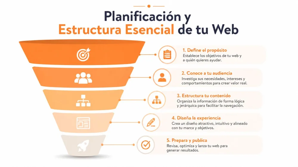
An effective structure in real estate web design reduces unnecessary choices. The visitor wants to orient quickly. They search by area, price, property type, square footage, number of bedrooms or a specific opportunity. If you force them to think too much, they leave.
A recommended structure includes a Home with search, a Properties page with filters, About Us, Communities and Contact, plus integration of 360° galleries and virtual tours. That combination keeps visitors oriented and moving toward inventory instead of bouncing.
The pages that actually matter
You don’t need twenty sections. You need the right ones.
-
Home with a visible search. The home shouldn’t act as a corporate brochure. It should lead to inventory as quickly as possible. If the search is hidden or too basic, you force users to navigate blindly.
-
Property listings with useful filters. Filtering by price and transaction type isn’t enough anymore. The experience improves a lot when users can narrow results effortlessly and without full page reloads.
-
Well-built property page. Most opportunities are won or lost here. The listing should answer real questions, not just copy the portal text.
-
About Us with trust signals. This page isn’t for abstract company copy. It should explain your specialisation, the areas you cover and how you work.
-
Area or community pages. These are key to rank for local searches and capture more qualified traffic.
-
Contact without mazes. If the visitor has to hunt for how to write or call, you’ve already added friction.
High friction vs low friction
A poorly planned site often looks like this: pretty home, extensive menu, click “properties”, too many options, poor filters, thin listing and hidden CTA.
A well-planned site does the opposite:
- Organises search from the first second.
- Groups inventory by user logic, not agency logic.
- Makes next steps visible — request a viewing, ask for info or save interest.
- Repeats trust signals throughout the journey, not only on the home page.
Good UX in real estate isn’t about “everything looking pretty.” It’s about getting the user to the right property faster and prompting contact without doubts.
How to decide the architecture before designing
Before touching colours or fonts, solve these three decisions:
| Decision | Bad practice | Better approach |
|---|---|---|
| Main objective | Trying to attract everyone | Prioritise buyer, seller or rental market |
| Navigation | Menu full of secondary pages | Short menu with business-driven paths |
| Local content | One generic services page | Pages by area, neighbourhood or typology |
When that foundation is right, design stops being improvised. Each page has a clear purpose. You see it in inquiries, lead quality and time saved by the sales team chasing low-quality contacts.
Designing a User Experience that Captures Leads
An empty listing with dark photos and rooms without context rarely prompts action. The user evaluates more than square footage, price and location. They try to imagine their life there. If they can’t picture it, they move on.
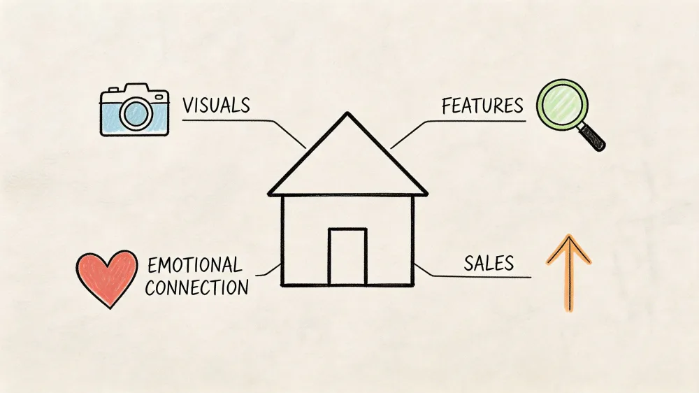
That shift in perception makes a big UX difference. A converting portal doesn’t just organise properties. It builds a visual narrative. Instead of presenting an empty flat as a dry fact sheet, it presents it as a comprehensible, desirable opportunity.
From a cold listing to a requested viewing
Consider a typical case. You add a new listing: empty flat, lifeless living room, uneven light, unfurnished bedroom and a terrace with potential that the original photos don’t show. Most agencies publish it as-is or wait to coordinate photographer, editing, video and, if budget allows, home staging.
That wait delays launch and raises production costs. Today the approach can be different. Improve the imagery, show a staged version of the living room with virtual home staging, create a short video for social media and add an immersive walkthrough to the listing. The property stops looking like an empty space and starts to read as a home.
Buyer-persona logic helps here. Not every user reacts the same. A family values layout and functionality. An investor wants clarity and speed. An international buyer needs stronger visual context because they won’t always make a first in-person visit.
UX elements that push contact
When visual material is well produced, the rest of the design must support it. These are the areas where real estate sites most often fail:
- Poor search. Hidden filters, too many fields or bad mobile experience.
- Weak CTAs. Generic buttons like “more information” when the user is ready to “request a viewing”.
- Long forms. Asking for too much data cools the impulse.
- Listings without continuity. The user reaches the end and doesn’t know what to do next.
If a property generates interest, the next step must be visible without forcing the user to think.
Offering an immersive experience inside the listing helps a lot. A useful resource on how virtual tours fit into the real estate sales process is this guide on virtual tours for realtors.
What a listing needs to convert better
You don’t need to fill it with modules. You need good order.
- Clear header with property type, area and main value proposition.
- Useful visual gallery. Not just many photos, but a logical sequence.
- Scannable description. Short paragraphs and actionable information blocks.
- Contextual proofs. Floor plan, surroundings, layout, possible uses.
- Repeated calls to action at key moments.
Once you apply this logic, video stops being decoration and becomes a sales tool. This example shows the kind of content that can strengthen a listing or a lead-generation landing:
Good UX in real estate doesn’t manipulate. It removes obstacles. And when you remove obstacles, the lead appears sooner.
Property Presentation that Sells
Visual presentation is no longer an add-on. It’s central to the sale. Anyone who still thinks “upload good photos” is enough is missing two points. First, a correct photo doesn’t always convey potential. Second, producing high-quality visual content traditionally requires time, coordination and continuous budget.
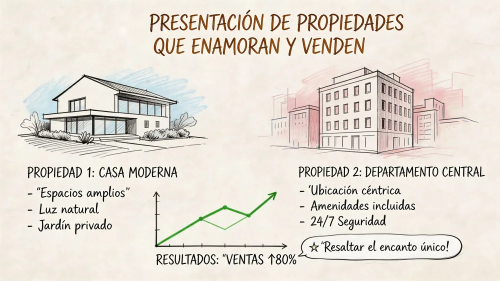
Integrating AI tools to create 360° virtual tours and immersive videos can cut the cost and turnaround of traditional professional photography dramatically, which lets you publish more listings, sooner, without sacrificing quality.
What changes when the listing shows potential
The practical difference is big. An empty flat no longer depends on the buyer’s imagination. An older property can be presented with a refreshed vision. A development can show finish options without waiting for final production.
This affects the business in several ways:
- You speed up the property’s online launch.
- You increase perceived value without redoing operations.
- You filter visits better because the interested party understands more before calling.
- You reuse the same base material across web, portals and social.
Operational tip: if a property needs too much explanation to be attractive, the visual listing isn’t doing its job.
How to choose the right visual approach
Not every property calls for the same treatment. The key is matching format to the capture type.
| Property type | Most useful visual resource | Why |
|---|---|---|
| Empty flat | Virtual staging | Helps understand scale, use and atmosphere |
| Property needing renovation | Render or renovated version | Shows potential without “imagine this” |
| New build or development | Video and immersive walkthrough | Enables a more commercial presentation |
| Premium property | 360° tour and video | Reinforces detail, flow and differentiation |
Also review basic best practices to prepare the original material. This guide on real estate photography tips is useful to improve inputs even when content is later optimised digitally.
The costly mistake many agencies keep making
The mistake isn’t hiring photographers when the property deserves it. The mistake is relying on a slow, expensive process for every listing when the website needs volume, speed and consistency.
I’ve seen agencies with great properties and poor presentation. I’ve also seen agencies with average inventory and much better visual execution. The latter usually get more from their site because they don’t publish half-done listings. They publish assets ready to sell.
If you want real ROI from real estate web design, think this way. The site doesn’t only need pretty content. It needs a repeatable system to turn each property into a solid commercial asset.
Choosing the Right Technology and Platform
The right platform isn’t the most popular one. It’s the one that fits your operation. If you publish few properties, need speed and don’t want to depend on developers, one option will suit you. If you manage volume, synchronisations and customisation, the decision changes.
Common solutions for real estate web development include WordPress with sector-specific plugins, website builders like Wix or Squarespace, or a CRM with an integrated website. Each fits a different stage of growth, and the right one depends on how much you publish and how much you rely on local SEO and visual content.
Comparison of web platforms for real estate
| Criterion | WordPress + Plugins | Website Builders (Wix/Squarespace) | CRM with Integrated Website |
|---|---|---|---|
| Real estate specialisation | High if you pick sector plugins | Limited | Medium or high, depending on provider |
| Design flexibility | High | Medium | Medium |
| Daily ease of use | Medium | High | High |
| SEO and technical control | High | Adequate, but limited | Variable |
| Scalability | Good | More limited | Good if the business lives there |
| Integration of visual assets | Usually viable | Sometimes more limited | Usually convenient if the system supports it |
| Vendor dependency | Low to medium | Medium | High |
When to choose each option
WordPress with plugins fits well if you want control, solid SEO and the ability to grow with custom features. It’s a good choice for agencies that understand their sales process and want to shape the site to that reality.
Wix or Squarespace work when speed and simplicity matter. They’re fine for a clean presence but often fall short when you need fine-grained filters, sector integrations or complex inventory.
A CRM with an integrated website works great if you want to centralise lead capture, follow-up and publishing in one environment. The risk is dependency. If the CRM’s web capabilities are limited, you end up adapting your business to the tool rather than the other way around.
The most important criterion
Don’t choose just by initial price. Choose by operational friction.
- If your team publishes often, prioritise ease of updating.
- If you depend on local SEO, prioritise technical control and structure.
- If your advantage is property presentation, ensure the platform supports tours, videos, galleries and fast pages.
- If you use a CRM heavily, value how much manual work it saves.
The best technology is the one that doesn’t get in the way. The one that lets the team sell, not fight with the website.
Local SEO and Analytics for Sustainable Growth
A real estate website doesn’t pay for itself the moment you publish it. It pays off when it attracts qualified traffic, converts that traffic into contacts and lets you improve with data. Without that cycle, the design stays a static investment.
Analytics tools let agencies measure key metrics and segment data by neighbourhood and geographic area. That’s especially useful for understanding which visitors show the most interest in specific locations, property types or price ranges.
What to actually look at in analytics
Many agency owners open Analytics, see traffic figures and close the tab. That number alone doesn’t help you decide. The useful insight appears when you connect behaviour and business.
Ask these questions:
- Which areas generate the most interest?
- Which listings retain users best?
- Which pages do people leave from without making contact?
- Which property type gets attention but no enquiries?
With that you can act. If a neighbourhood attracts a lot of traffic but few enquiries, maybe it lacks context, trust or a better CTA. If a particular property type retains more users, maybe it deserves its own landing page or specific campaigns.
A real estate agency improves faster when it stops debating opinions about the website and starts reviewing real user behaviour.
Local SEO that actually drives leads
In real estate, useful SEO is usually local. You don’t need to rank for huge, vague terms. You need to show up when someone searches with concrete intent in a specific area.
That means doing a good job on:
- Neighbourhood or municipality pages with their own useful content.
- Well-structured, easily crawlable property pages.
- A cared-for, up-to-date Google Business Profile.
- Load speed, especially on pages with many images or visual resources.
If you want to go deeper on connecting rankings and real estate business, this guide on SEO for real estate marketing offers a practical perspective. It pairs well with a clear view of how a digital real estate agency turns online visibility into booked viewings.
The value of cross-referencing market and behaviour data
When you combine your website analytics with local demand data, you make better commercial decisions. For example, if you focus on a particular city and need to understand a neighbourhood better, it helps to look at local pricing data and compare it with the interest you see in your traffic and your forms.
That cross-reference helps with three very concrete things:
- Adjusting the content of your area pages.
- Spotting opportunities to win seller leads.
- Prioritising properties and neighbourhoods in paid campaigns or content.
The winning combination isn’t SEO alone, design alone or data alone. It’s using all three as one system.
Conclusion: Your Next Step Toward Digital Success
A good real estate website isn’t measured by how modern it looks. It’s measured by how well it guides the user from search to contact. When the structure is clear, the experience reduces friction and the visual presentation shows the property’s real value, the website stops being a passive showcase.
That also changes how you should invest. It’s a mistake to put all your budget into surface-level design and leave operations, local SEO, analytics or visual assets as an afterthought. That’s where many agencies lose money without realising it.
If I had to sum it up in one idea, it would be this. Real estate web design works when it connects marketing, product and sales in a single flow. The website attracts, guides, convinces and hands a useful lead to the sales team.
Start with something simple. Review your structure, look at your listings as if you were a buyer and remove every unnecessary step. Then improve how you present your properties and measure what changes. That’s where real growth begins.
If you want to speed up that process without depending on photographers, editors and several different tools, Pedra lets you create the visual assets a real estate website needs to convert better from a single platform: optimised images, virtual staging, videos and 360° tours ready to embed, share and use for lead generation.

Related Posts
How to Market a Real Estate Listing: The 6 Things a Professional Listing Needs
The six assets a professional real estate listing needs — photos, video, virtual tour, floor plan, s...
Best AI Video Tools for Real Estate Agents (2026): Tested and Compared
Nine AI video tools compared for real estate work, with current prices and the one distinction most ...
Best Virtual Staging Software (2026): Seven Tools Compared on Cost Per Listing
Seven virtual staging tools compared with current prices, priced the way you actually buy — per list...
BoxBrownie Virtual Staging Pricing (2026): What It Really Costs Per Image
BoxBrownie charges €30 per image for virtual staging with under-48-hour turnaround. Here's the full ...
Listing Presentation Templates: Win More Clients
Professional listing presentation templates that close deals. Customizable CMA templates, market ana...
Win More Deals with Your Real Estate Listing Presentation
Master your real estate listing presentation to attract clients and close more deals. Learn expert t...